Light vs Dark Mode: A  UI/UX Designer’s take
After the recent completion of a UX/UI project where I was able to utilise a switchable light/dark theme, this was a great way to look back at the choices I was faced with and the interesting insights I had found out along the way.
Every designer starts an interface design by doing the same thing, drawing a canvas or frame (depending on who you speak to), which almost always starts off as white. Dismissing any colored applications for now, this canvas probably more often than not remains white, or at least something very close to it. Certainly not always the case however, some go on to be flipped into a ‘Dark Mode’, becoming increasingly popular as new implementations emerge. Many people’s first major experience with dark mode was likely the launch of I OS 13 and Android 10 in 2019, this gave the experience of a full system-wide dark mode into millions of hands. Join me as I attempt to shine the light on the true benefits of each in the world that is UI/UX design, share the struggles that kept me up at night, and navigate the complex accessibility and user preference considerations that shaped my designs.
What is Dark Mode?
Most pieces of UI we interact with today have a bright, ‘light mode’ feel to them as standard, It’s been the default for many years and will likely stay that way for a while (unless Elon Musk has anything to do with it). A dark mode is simply the ability to switch the UI into a more nighttime-friendly, eye-strain-reducing color palette usually swapping out bright white elements and dark text for shades of dark grey alternatives and bright text. By making the background elements such as tiles and sections, which make up a lot of the light, darker, whilst making the important stuff like text and buttons bright, you’re able to reduce light emitted from the device whilst maintaining good levels of contrast for the users.
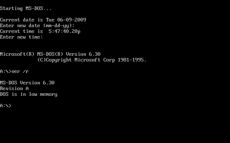
Dark mode is often considered to be something that has popped up over recent years but when you really think of it, the original command line interfaces of computers from way back when reassembled far more of a dark mode than much of what we see today. So really, what many people consider to be a modern trend used by designers to stand out from the crowd, has actually been around for a lot longer than many of us would first think. Although this wasn’t really a conscious choice by the designer, more of a limitation in hardware at the time, it does show that dark mode is ultimately the original when it comes to computers and UI.
Light vs. dark.
As we just looked at, the original interfaces were very much dark mode, so what happened for us to completely flip the switch when we moved onto GUI (graphical user interface) and make everything bright? Paper is what happened, In an effort to make computers appeal to a wider market than just programmers, interfaces started trying to replicate what people were used to using in life, bright, white, paper. This really makes sense when you think about it, part of a UX/UI designer’s job today is to make a product feel familiar and make the user work less. Different isn’t always bad, but people are stubborn, and different gives them something to moan about. So, unless you count a chalkboard, bright, familiar white was the obvious route to take.
It’s quite hard for me to actually outline the concrete benefits of a light mode due to conflicting views shared online. For every study that says it’s easier to read on a lighter background, there’s another to say why it’s not. One benefit that does seem to be clear however is the ability to work more easily in direct sunlight when working with a light-themed UI. Darker screens seem to get washed out and are harder to read in a bright setting, but are much more comfortable when working in a dimly lit room or at night.
As for energy-saving claims, it does seem this really only applies to devices with an OLED screen, which granted is becoming more popular every year but still doesn’t compare to the dominant use of traditional LED screens.
Ultimately, I think the biggest deciding factor on whether a person decides to use a dark or light mode just comes down to personal preference. We live in a society that values personalization, we’ve come to expect choices that give us the freedom to mold experiences to suit our surroundings, preferences, or even moods. I think the key takeaway is always going to be to give the users a choice, I don’t feel one really is better than the other, each has its place, and the opportunity to switch between the two just wins.
My first time…
Having only a couple of years of experience behind me, designing a major user interface with a switchable theme was something I’d not actually completed before. In fact, a recent, fairly large SAAS project I’ve been working on is what sparked the idea to write this blog. Quite un-traditionally, when I started the design of the Periscope UI, I didn’t start with a white frame, choosing to begin instead with a palette of very dark greys for the different levels of backgrounds. There was no intention of ever calling this a ‘dark mode’, with the intention of designing a light mode further down the line, originally at least, it was simply the style I chose to implement. Whenever I faced doubt as to whether this was okay to do, I kept coming back to the likes of Spotify (where the dark theme is all you get), thinking ‘If they can do it, why can’t I?’.
I actually found working with the darker elements allowed for some more freedom in some areas, for example, you can use much brighter colors for things like buttons, highlighted text, or icons whilst maintaining a good level of contrast for accessibility. Maintaining at least an AA accessibility grade for all text and buttons was important, it wasn’t specified by the brief but it’s really something all designers should aim for as a minimum. Working with darker backgrounds gave me the ability to use bright green as a secondary highlight color, this is almost always impossible on a lighter background as the readability just gets lost.
Eventually, however, the realization that a light mode would have to be built started to set in. There was just the worry of these claimed disadvantages looming over my head, as well as concerns over a drastic change from what the industry is used to from stakeholders in the project. As said earlier, change can often be met with stubbornness, and the water modeling world is no different, we were already making huge waves in our approach to software design, and making it all dark on top of that could be pushing it. So, a long, tedious process began trying to redesign the interface with a light theme. There were some struggles, working with dark grey meant I could go lighter and darker as I saw fit, however, when using white, you can’t really go any lighter. And yes, I could’ve used an off-white as the basic color but then everything started to feel very grey, almost giving Microsoft Word 1997 vibes. There was also the issue that my green no longer worked, meaning it had to be swapped out for another colour which kind of sucked in all honesty, I liked the green. Ultimately though, we all knew it was best to be able to offer the user a choice in a light or dark theme, we’d mitigated any concerns and could boast about the benefits of each.
Future Trends and Conclusion
Looking back at the Periscope project, I think I’d always make an effort to really consider how and where the screens I’m designing are going to be used. It plays such a huge role in every decision of design and the choice between a dark and light theme is no different. I think in the future we’ll see more and more interfaces being offered with an alternative, look at Linear, for example, with 4 different custom themes for users to choose from. Coming back to customisability, users like to make software their own, and I think more companies are coming to realize that and want to implement such freedom.